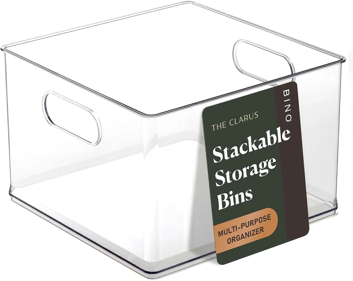
Transparency is not a style choice. It is a decision about whether a shelf can be read from the doorway, and it has costs as well as benefits.
There is a version of this article that says clear bins are better and finishes in one paragraph. It would be wrong, and it would be wrong in a way that costs the reader money, because the clear bin is the wrong choice in about a third of the places people put it.
What follows is the actual decision: what transparency buys you, what it costs you, and the three situations where an opaque basket is the better object. We make all three kinds, so we have no particular stake in the answer.
The argument for a clear bin is one sentence long. What is inside it is the label, which means there is nothing to write, nothing to update when the contents change, and no opening of four containers to find the one with the batteries in it.
That sounds minor and it is not, because labels decay. Every labelled storage system in every house drifts out of date within about a year: the box marked "school stuff" holds cables now, the one marked "spare bulbs" holds three bulbs and a roll of tape. Relabelling is a task nobody schedules. A clear wall never goes out of date because it is not making a claim.
The second benefit is quieter. A clear bin shows you how full it is, which is the piece of information that governs restocking. You do not open a clear bin to find out you are out of coffee filters; you see it from the doorway and write it down.
A label describes what you put in a year ago. A clear wall describes what is in there now. Those are different pieces of information and only one of them is reliable.
From a note in our range planning file
Three things, and the first one is the one that makes people quietly regret the purchase.
An opaque basket makes any shelf look tidy from the moment you put things in it, because it converts a jumble into a rectangle. A clear bin does not. It shows the jumble through a wall, and it also shows the crumbs at the bottom, the split packet and the thing that leaked in March.
That is a feature in a cupboard, where honesty about the state of the shelf is what makes you deal with it. It is a liability in a room people sit in, where the shelf is part of the furniture and nobody wanted a display of cleaning products.
Fine scratches that are invisible on a matte surface catch the light on a polished clear one, and after a year of sliding in and out of a cabinet a clear bin looks used in a way a frosted one does not. Nothing about it works less well. It just looks its age sooner.
A clear bin makes a badly sorted shelf legible rather than tidy. If the contents genuinely have no category, seeing them through a wall does not help, and this is the honest limit of every storage product ever made: the container is a consequence of a decision about categories, not a substitute for one.
| Clear | Frosted | Woven or opaque | |
|---|---|---|---|
| Read from the doorway | Fully | Roughly: level and colour | Not at all |
| Looks tidy regardless of contents | No | Mostly | Always |
| Needs labelling | Never | Sometimes | Always |
| Shows scratches | Soonest | Rarely | Not visibly |
| Best room | Pantry, fridge, utility | Open kitchen shelving | Living room, hallway, bedroom |
| Worst room | A room with guests in it | A deep dark cupboard | Anywhere you rummage |
The frosted middle option is underrated and it is the right answer more often than either extreme. You can see that a bin is half full and roughly what colour its contents are, without reading the packaging of everything inside it. On open shelving in a kitchen that is exactly the amount of information you want to give a room.
A refrigerator is the one place where we would argue the choice is already made for you, for a reason that has nothing to do with looks.
Food in a fridge has a clock on it, and the clock is only useful if you can see what is running it down. An opaque bin in a fridge is a small dark cupboard inside a cold cupboard, and the thing at the back of it will be discovered in three weeks by smell. Every study of household food waste finds the same mundane mechanism at the bottom of it: people throw away what they forgot they had.
There is a second reason, and it is the one that cuts against selling you more bins. Cold air has to move around food for a fridge to do its job, and the FDA says so directly: keep the appliance at 40 degrees Fahrenheit or below, and avoid overpacking. Bins make it very easy to pack a shelf solid, and a clear bin at least lets you see that you have done it.
The arrangement that follows from both facts is the same one: fewer bins than the shelf will hold, grouped by when you use things rather than by what they are, with the back row left clear. Breakfast in one, lunch things in another, the jars that live forever in a third at the back.
General food safety information from a public agency, not advice about your particular kitchen and not a safety claim about any particular product.
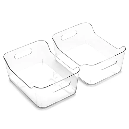
Two materials do almost all the clear work in this catalogue, and they behave differently in ways worth knowing before you buy.
PET is the glass-clear one. It is what most of our clear bins are, it takes a polish, and it is the material that looks best on a shelf. It is also the one that shows scratches soonest, and it does not enjoy a dishwasher.
Polypropylene is the tougher, slightly milky one. It survives being dropped, it copes with heat, and it is what we use where a bin is going to be washed regularly or lives in a freezer. The trade is that it is never quite as clear, and the same collection sometimes exists in both.
Neither contains bisphenol A, and where that is relevant we say so. It is worth being precise about what the phrase means, because it is used loosely everywhere. The FDA's position is that BPA is safe at the levels found in food and its approved uses in food packaging remain approved; the reason it came out of baby bottles in the regulations was that manufacturers had already stopped using it there, not a new finding about risk. So "BPA free" on one of our bins is a true statement about the plastic. It is not an implied claim that anything containing BPA is unsafe.
General information from a public agency about a material, not advice about your particular use and not a safety determination about any particular product.
The finish question resolves differently in each room, and it resolves for reasons that have nothing to do with taste. Here is how we would answer it room by room if somebody rang and asked.
A pantry is a rummaging shelf, which settles the finish immediately. The refinement worth knowing is the front height. A bin with a low front lets you see the second row from standing height without pulling the first row out, and on a deep pantry shelf that is the difference between a system you maintain and one you abandon in a month.
The other pantry-specific point is that packaging is loud. A shelf of clear bins full of branded cardboard is visually busier than the same shelf with no bins at all, and decanting into plain containers does more for a pantry than organising it does. If you are not going to decant, a frosted bin is the kinder choice.
Covered above and worth repeating in one line: clear so the clock is visible, and fewer bins than the shelf will hold so the air can move.
Here the finish question is genuinely secondary to drainage, because the failure mode is not clutter but a puddle that sits under a bottle for a fortnight. Choose on the base first and the walls second. Under a basin, where the light is poor and you are looking down into everything anyway, clear buys you almost nothing and a solid-coloured bin hides the state of the cupboard in a helpful way.
A wardrobe shelf is a display shelf whether you meant it to be or not, and it holds soft things that look like a heap through a clear wall. Opaque wins here more decisively than anywhere else in the house. Label by season rather than by garment: "winter" is a category you will still recognise in two years, and "jumpers" is a category that will have quietly become something else.
This is the part of the article where a storage company is expected to stop. It is worth continuing, because it is the most useful paragraph here.
A container makes a decision visible. It cannot make the decision. If a shelf holds forty items that belong to eleven categories, no arrangement of bins will make it feel calm, because the problem is that there are eleven categories on one shelf. The bins will make the eleven categories legible, and legible chaos is still chaos, just better documented.
The test we use internally when deciding whether a size is worth making: can somebody name what goes in it in two words? "Baking", "first aid", "school". If the honest answer is "various", then what that shelf needs is half an hour of decisions, not another bin. Every organising system that gets abandoned was abandoned at exactly this point.
The corollary is cheerful. Once the categories exist, almost any container works, and the finish question becomes what this article says it is: a question about whether you want to read the shelf from the doorway.
For the opaque containers that genuinely need labels, one technique outperforms all the others and almost nobody uses it: label the shelf, not the bin.
A label on a bin travels with the bin. It goes to the kitchen table, comes back in the wrong place, and now the shelf reads in the wrong order. A label on the shelf edge stays where the category is, and the bin that belongs there is simply the one in front of it. It also survives replacing the bin, which is the thing that eventually happens to every bin.
The second technique is to label by moment rather than by object. "Breakfast" beats "cereal and spreads", because the question you are asking at the cupboard door is what you are about to do, not what class of goods you require.
Stand in the doorway of the room and ask one question: when this shelf is full, do I want to see what is on it?
If the answer is yes, clear. If the answer is "I want to see roughly", frosted. If the answer is no, opaque, and accept that you are signing up to labelling. That question resolves the decision faster than any comparison of materials, because it is the question the shelf is actually going to ask you every day for the next five years.
Whichever way it goes, buy the pieces for one shelf from one collection: they share a rim and a wall, so they sit flush instead of leaving gaps. The families are listed on the BINO catalogue, and if the fit is what you are unsure about, our guide to measuring a shelf is the companion to this piece.
For the hardest room in the house, where all of this gets complicated by plumbing and damp at the same time, there is our guide to the cupboard under the sink.